"I feel off" is where most of us get stuck
Stress about money, a hard week at work and a quiet sense of being stuck all blur into "I'm not okay." Journaling helps but takes too long. Mood apps either feel clinical, like filling in a medical form, or too shallow, with five smiley faces and nothing learned.
"Bad" covers anxious, lonely, stuck and ashamed. Each needs a different response.
Feelings are tied to areas of life such as health, money, love and work. Most trackers ignore that.
Without time and frequency, people can't see that Tuesday evenings are always hard.
Logging a hard feeling into a cold form can make it feel worse, not better.
Who it's for
- Context
- Manager in Bengaluru, juggling a demanding job, an EMI and family expectations.
- Needs
- A 30-second pause that helps her see what's actually draining her.
I know I'm tired. I just don't know if it's work, money or me.
- Context
- Sees a therapist every two weeks and forgets what happened in between.
- Needs
- A record he can scroll back through or export before a session.
By Thursday I can't remember how Monday felt.
- Context
- Reads about mindfulness and has tried journaling apps, but drops them after a week.
- Needs
- Something light, pretty and rewarding enough to come back to.
If it feels like homework, I won't do it.
Personas are illustrative.
It's hard to deal with a feeling you can't name. I wanted checking in to feel kind.
If the check-in is warm, fast and immediately rewarding, people will come back daily. Over time, those small entries add up to patterns they could never have seen on their own.
How it feels to use, step by step
I mapped the check-in as an emotional journey, not a funnel. The low points are where design has to do the most work.
Ten design practices I leaned on
Every line of copy is written like a kind friend, because words do as much work as layout in an emotional product.
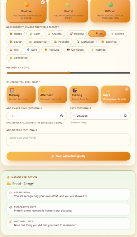
Choose Positive, Neutral or Difficult first. Only then do 17 precise moods appear. Nobody faces 51 options at once.
Naming a feeling precisely helps people process it, so "Difficult" opens into Anxious, Stuck, Lonely, Ashamed, Overwhelmed and more.
"Difficult," never "Negative." Neutral is described as "okay, mixed, reflective or low-energy," so a flat day is valid too.
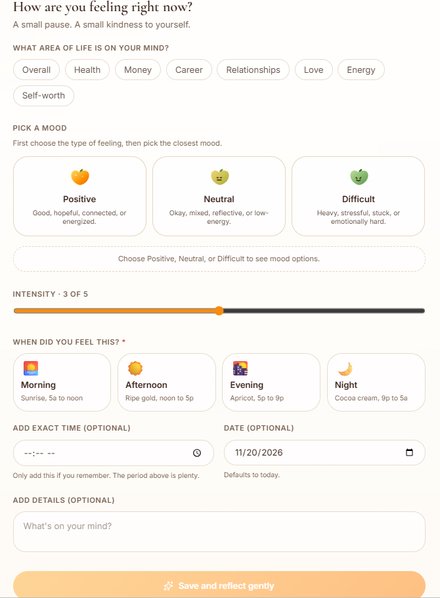
Only mood and time of day are required. Every optional field says so, and reassures the user that skipping is fine.
Date defaults to today and intensity starts at the midpoint, 3 of 5. Fewer decisions, faster check-ins.
Mood is fruit ripening. Green, unripe mangoes for difficult, gold for neutral, orange for positive. Progress ranks start at Mango Seed.
Saving a check-in instantly returns a reflection: an appreciation, a perspective shift and one small step of five minutes or less.
The privacy promise sits directly under the sign-in button, which is exactly where people hesitate.
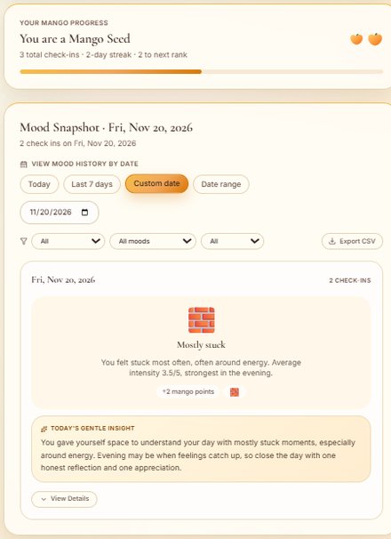
Patterns are written as sentences, not charts, so they read like a friend noticing something.
How are you feeling right now?
A small pause. A small kindness to yourself.
The screens, with notes
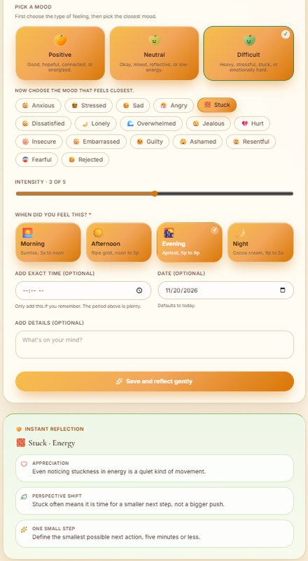
The selected card gets a check mark and a darker border, and the mango face tells you which family you're in.
Every mood chip pairs an icon with a word, so it stays readable for screen readers and unambiguous across cultures.
Morning is "Sunrise," afternoon "Ripe gold," evening "Apricot," night "Cocoa cream." Even a time picker carries the brand's warmth.
The response card shifts from mango to soft green. The visual temperature drops just as the user moves from describing to reflecting.
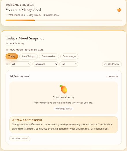
"You are a Mango Seed · 2-day streak · 3 to next rank." Small, collectible mangoes reward showing up.
Today, last 7 days, a custom date or a date range, filtered by area, mood and time, with a CSV export for therapy sessions.
"Mostly stuck. Average intensity 3.5/5, strongest in the evening." Then a gentle suggestion for how to close the day.
"Your reflections are waiting here whenever you are." No red zeros, no guilt.
Colours borrowed from mangoes
How are you feeling right now?
An elegant serif for questions and titles makes the screen feel like a journal, not a form.
Only add this if you remember. The period above is plenty.
A clean sans for instructions and data keeps small text easy to read on a phone.
v1 Classic to v3 Green Mango.
I version the design in public: the badge in the corner names each release. Here's what changed, and why.
What I'd fix next (my own critique)
Reviewed the way I'd review a teammate's work: what I see, why it matters to the user, and what I'd try next.
What I'm measuring
Targets for the first 90 days, not results.
Self-awareness comes from repetition, and patterns only appear with regular entries.
- Target 40% of WAU
- Median check-in time < 30s
- Check-in started to saved > 85%
- Check-ins with a specific mood > 75%
- Reflections rated helpful > 70%
- Snapshot views per WAU 2+ / week
- Sign-in screen drop-off < 35%
- Support card shown on high-intensity difficult moods 100%
- Users lost after a broken streak tracked
- Mood data shared with third parties zero
What I learned
The check-in matters most when someone feels awful. Every choice has to work for that person, not for the cheerful one in the mockup.
Changing "Negative" to "Difficult," and "Submit" to "Save and reflect gently," did more for the feel of the product than any colour change.
Filling the cards in v3 made them feel tactile but blurred the selected state. Iteration means checking that each fix didn't break something else.